
Controlling Your Vision Part II
The Non-Technical Explanation of Lighting, Composition, and Aesthetics

Hello, and welcome back to part II of Controlling Your Vision. This post is for writers and directors who don’t know anything about cinematography but who want a non-technical explanation for how to connect their frames to the deeper meaning behind their stories. In Part I we explored different shots and how they can be used to convey the right information to your audience. We also looked at different lens options and how to utilize each one to enhance your emotional payoffs.
Now we’re gonna talk about lighting, composition, and aesthetics. Again, these concepts may seem irrelevant to writers and directors, but understanding them can significantly help you convey your stories more effectively to your audience.
So, Let’s begin with...
Lighting
The most important layer of cinematography is lighting because it sets the mood of the scene. We intuitively know that darkness represents negativity while light represents positivity. So as a storyteller, if you know how to control light, then you can control how objects and people are perceived by the audience.
Take this last shot from the movie, Talented Mr. Ripley as an example. We see Matt Dameon’s character standing against a wall. On one side, his face is completely lit, but as the camera tracks around him, we see the other side of his face completely darkened.
The director, Anthony Menghella, did this because it expressed a strong “period” at the end of this whole story about a psychopath who ends up killing everyone he falls in love with. The shift in lighting emphasizes this point that the character has an incredibly dark side, masked by a vibrant persona.
It’s moments like these that show us why it’s important to have a basic understanding of lighting because, with it, you can convey the complexity of your characters and story more powerfully as Menghella did in this 90’s classic. He did it this way because he wanted to make that “inner story” pop out of the frames and emphasize these contradictory sides of the main character.
This is called visual subtext and there are a whole bunch of different ways you can meaningfully convey this with lighting. But in order to know how to do that, it’s good to have a basic understanding of the three-point lighting setup so you can, at least, work within the proper ballpark. This kind of setup includes key lighting, fill lighting, and backlighting.
Key Lighting
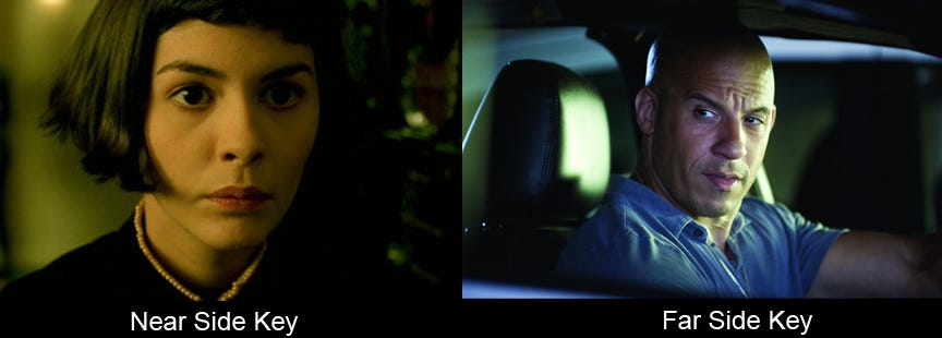
Your key light is the most important one to set up, first, because it’s the main “light source” that’s illuminating your subject. Where do you position this light? Honestly, wherever it can best light your actor’s faces. But typically, it’s positioned at a 45-degree angle from the camera, either right or left, depending on where the line of action is taking place and whether you want to show a far-sided or near-sided key light on your subject.
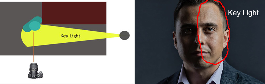
Near-side refers to the side of their face that is closest to the camera. Far-side refers to the part of their face that is furthest away from the camera. In other words, if the key light is on the line of action (on the side where the camera is), then it’s a near-side key. If it’s on the other side of the line of action, then it’s a far-side key. Using a near-side key makes the image look flatter, which is why most people use a far-side key.
There’s also the added dimension of broad versus short key lighting. Broad lighting is when your key light is closer to the camera, which hits the face more directly. This produces a much warmer feel to your subject. Short lighting is when the key light is further away from the camera, which produces a darker feel as there’s more dimensionality and contrast.

Fill Lighting
This light is used to fill in some of the shadows on the side of the subject where the key light isn’t striking it. So more or less, you place it 45 degrees away from the camera, opposite where your key light is.

Filmmakers use this because most of the time we don’t want to make our shadows completely dark nor do we want to completely illuminate them, unless that’s our intention. Remember, shadows are extensions of your stories that express negativity, so learn how to create them for the right moments.
Back Lighting
This is pretty much what it says. It’s the light you use to highlight the edges of the face, head, hair, shoulders, or back edge of whatever object you’re shooting. Generally, it’s placed behind the subject on the opposite end of where your key light is.
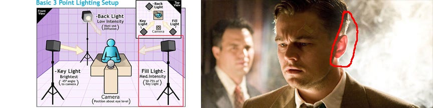
This makes the subject appear to have more depth, which makes it visually interesting. And if you’re ever on set and hear, “hair light” or “kicker”, they’re talking about a backlight. Cool. Now, you have some words to sound more confident on set!
Composition and Aesthetics
Composition and aesthetics are techniques for directing the audience's attention. Just as with lighting, if you can understand the basics then you can more effectively convey the subtleties in your character’s emotions and help guide the audience’s understanding of your story in a deeper way. In other words, it’s the art of visual subtext. So let’s go over some basic techniques.
Shallow Versus Deep Depth of Field
A shallow depth of field is when the background of your shot is blurry and the foreground is in focus. A deep depth of field is when the background and foreground are both in focus. This is achieved by manipulating the F-stop on your lens, which is just a nob that also controls how much or how little light is exposed in the shot. A low F-stop setting means a lot of light will enter, but it also means you’ll get a shallow depth of field. A high F-stop means you’ll get a deep depth of field, but less light will enter the shot.
Most use a shallow depth because it’s more aesthetically pleasing, and it makes it easier for the audience to focus on the subject. Plus, you don’t have to use as many lights. However, you may want to use a deep depth of field if there’s something in the background that’s important.
A great example is this scene from Citizen Kane. We see a young Charles Kane playing outside in the background, and in the foreground, we see his parents giving guardianship over to a man, which fundamentally shapes the rest of this kid’s future. They chose to use a deep depth of field because it was important to show a happy vibrant kid juxtaposed with a decision that would take away his innocence. Furthermore, the sled that Kane is using in this scene is fundamental to the end of the story, so it needed to be highlighted at this moment for everything to make sense.
But utilizing a shallow depth of field at the right moments can also bring meaning out of your scene. Take, for example, this end scene from the movie, Inception. Logistically, it would have been easier to increase the F-stop for this tracking shot because then they wouldn’t have had to constantly adjust their focus to capture every character.
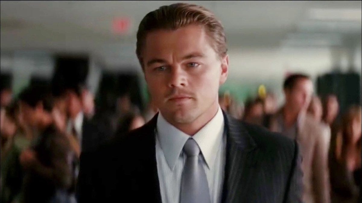
However, they chose to use a shallow depth of field because they really wanted to emphasize this connection between the characters and that huge experience they just underwent in comparison to the normal hustle and bustle of everyday society. It’s as if Nolan was saying, “We just went through some crazy shit, all within this one individual’s head…And no one even knows it happened.” Using shallow depth allowed the director to drive this feeling home without having any of the actors spell it out in the dialogue.
Shapes, Lines, and Perspective
When you take a picture or film anything, you’re always going to see lines, shapes, and different perspectives from where the camera is capturing the subject. Obviously, because you’re depicting reality in reality. So it can’t be any other way. And utilizing these elements can make a huge difference in how you convey stories on screen.
For instance, by identifying major lines within your frame, you can adjust the placement of your camera (perspective) and use them to draw people’s attention to something. But it’s not just lines that can accomplish this. You can also create artificial lines using shapes in conjunction with perspective.

So don’t just settle on a shot that’s looking directly at something. Shift the camera around, adjust your props, and character’s positions, and find those lines to draw people’s attention to something.
The Golden Ratio
The Golden Ratio is just a compositional guide, similar to the rule of 3rds, only it’s based on the famous Fibonacci Spiral. You can really dig into the math if you want, but for the sake of composition, you just need to know this one principle. The area in your shot with the most details should be framed in the smallest box of the coil shown in this image.
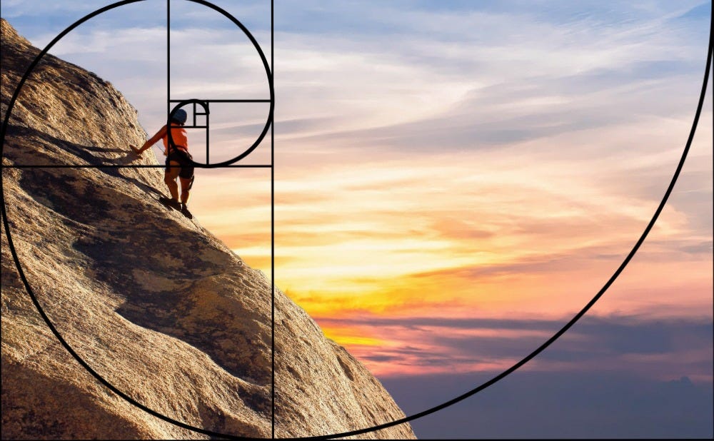
And no, it doesn’t have to be in the left corner. It can be anywhere you want. Also, you don’t have to apply the Golden Ratio for every shot. But it can certainly be very powerful when capturing wides where there’s a lot of something happening in one area and not a lot in another as it draws people’s attention to the action you want them to be paying attention to.
Negative Versus Positive Space
This element of composition is in reference to the subject of interest versus the surrounding area of that subject. Positive space is the area in the frame where the subject is. Negative space is the background or the area surrounding the subject. You can have a shot that’s mostly positive space, negative space, or balanced space.
Utilizing negative and positive space by manipulating their position, rhythm, and symmetry can really help enhance your aesthetics.
Magnetism of Frame
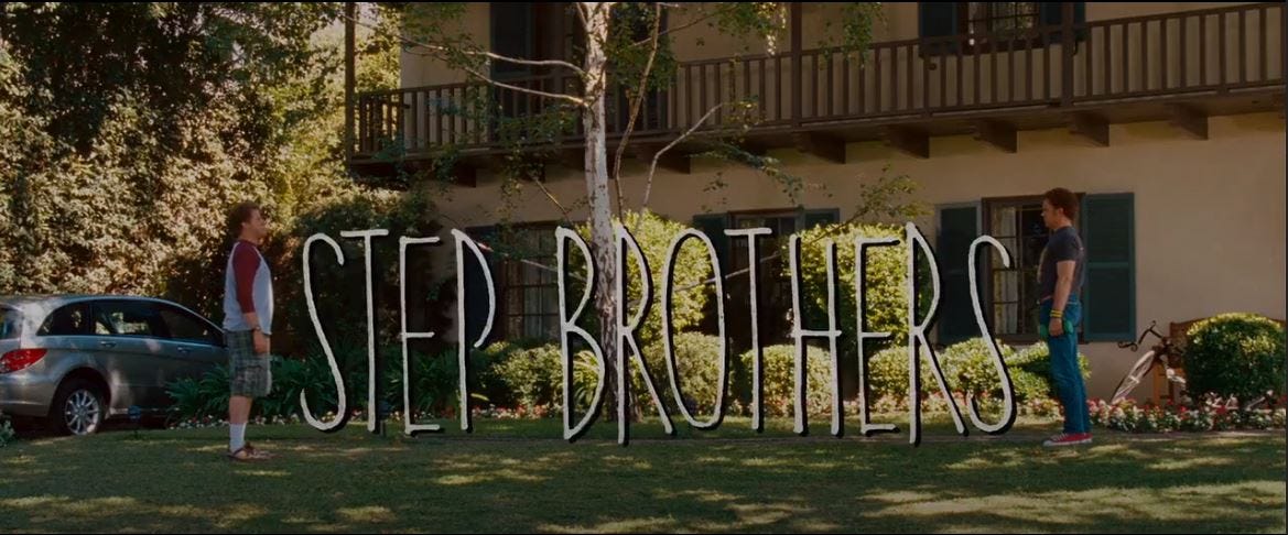
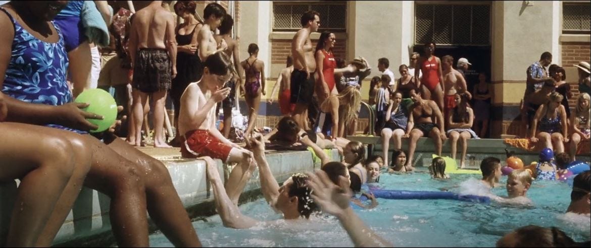
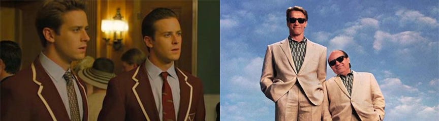
This is the idea of putting your subjects closer to the edge of the frame, which creates this kind of magnetism effect. Take the movie, Step Brothers as a great example. In the beginning, we see the two characters having this tense stand-off at the end of the opening credits. The two characters are framed at the edge of the screen opposite of one another, which automatically evokes this sense of tension between them or this magnetic push.
But as the movie progresses, they begin to warm up, and this is expressed through their close proximity to each other in relation to the edge of the frames, which creates a kind of magnetic pull toward one another.
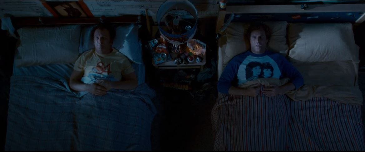
That’s what putting your subjects closer to the edge of the frame does. It creates this push/pull effect depending on how far each subject is from one another. So bottom line: Subjects further away along the edges = push. Subjects closer to each other along the edges = pull. It’s as simple as that.
Color
This one is kind of a no-brainer as it’s generally intuitive for most people, but understanding what different colors can emotionally evoke is also really helpful for bringing out the meaning in your film. For instance, maybe you have a scene like on Minority Report where a man lost his family years ago and is still wallowing in despair. Using cooler tones like gray or blue can give off this sense of sadness and melancholy.
But let’s say you want to show a flashback of a good memory he had with his family. In those flashbacks, you may want to use warmer and more vibrant colors to evoke this sense of happiness and nostalgia, as Speilberg did in this movie.
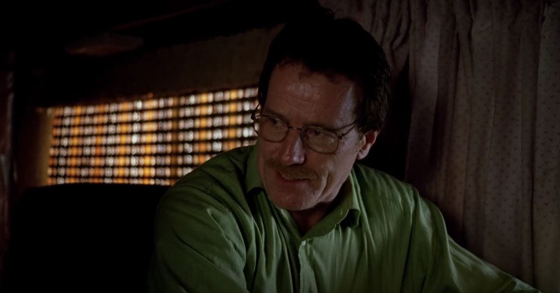
You can even utilize color in your set design and wardrobe to magnify the meaning behind the characters. Breaking Bad is, perhaps, the greatest example of this. If you’ve seen it, then you may have noticed that certain color schemes were consistently assigned to specific characters throughout the series. Beige, which represents boring or non-threatening was what the main character, Walter White, wore in almost every scene at the beginning of the story before he got into meth-making.
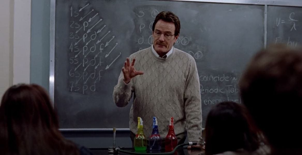
But then suddenly once he started making real money, green colors started popping up in his living space and clothing because green represents greed and money.
The rest of the ensemble also had their own colors designated to them, which matched their roles and personalities in the story, such as his wife Sklar who seemed to always wear blue colors.
That makes sense because throughout the series she struggled to remain loyal to her husband, and blue represents loyalty. So, learn what different colors represent and take advantage of that to drive the meaning in your characters and environment.
Balanced Versus Unbalanced Frame
This is a compositional technique where you arrange the subjects and objects in the frame so that each of them holds equal (balanced) or unequal (unbalanced) visual weight. This can be great for showing power dynamics or a hierarchy of importance between people and objects.
Beyond simply arranging your people and objects, you can also infer balance using color, tones, and concepts. For instance, showing a baby next to a grown adult evokes a sense of unbalance based on age. But showing two well-built fighters opposite of one another in a fighting ring evokes a sense of balance based on strength.
Frame Within a Frame
Now, this compositional aesthetic is one of my favorites. Basically, you put a frame around your subject within the frame of the shot. So for instance, showing a person behind a doorway but being far enough to show the frame of the door. It’s a frame within a frame.
This is perfect for showing a character feeling trapped, and it’s why we often see these shots in horror or thrillers. But they most certainly exist in all movies across all genres because it looks cool, and it says a hell of a lot about what your character is going through at that moment.
Conclusion
There’s certainly a lot more to cinematography than what’s covered in this post, so treat this information as a starting point that will hopefully encourage you to go out and put some practice into the craft. And hey, I get it if it’s not your jam. Trust me, I’m not a huge fan of the technical side of cinema, either.
But having the fortune of working with a brother whose great at cinematography has taught me that even just possessing a basic understanding of the craft can significantly help you convey your ideas to those who will be shooting your film. Obviously, unless you’re directing and producing it, you can’t call all the shots.
However, if you understand how cinematographers work then, whether you’re a writer, a director, or both, you’ll have better control over your vision because you’ll be able to judge cinematic decisions much more effectively and know if something is going to work or not. This, of course, becomes less important if you’re working with the right cinematographer, but you won’t even know they’re the right person for the job unless you develop that visual language.
So that’s gonna do it for this post. Again, thank you for checking this out, and as always, best of luck in your creative endeavors!
Story Prism, LLC
___________________________________